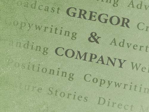
This design is the result of an open competition to design a new logo for the Advertising Club of Western Massachusetts. My entry was judged the winner by vote of the club membership.
The design solution treats the club name and contact information as an advertisement. The stationery was printed as black and opaque white inks on tinted paper.
This logo was recognized in Print Magazine's Regional Design Annual and a book: “Print's Best Letterheads and Business Cards.”