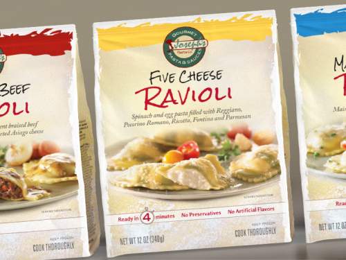
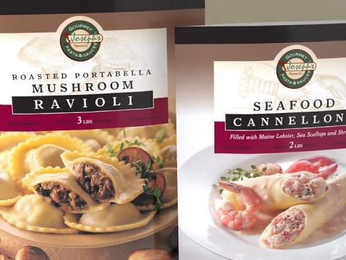
The client was introducing a new line of pasta meal kits and needed a design with a more upscale look than their appetizer products. Different fonts and treatment for the logo and header achieved this goal, as well as a centered, classic photo composition.
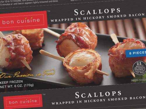
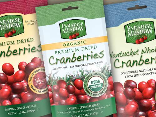
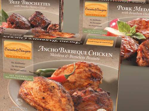
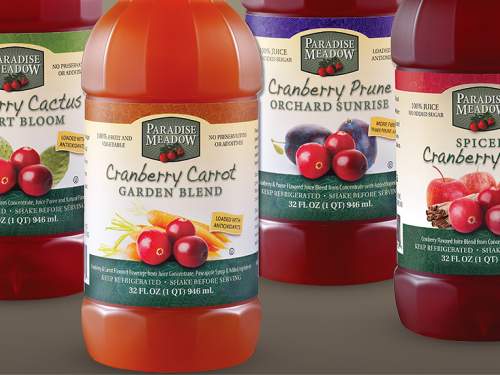
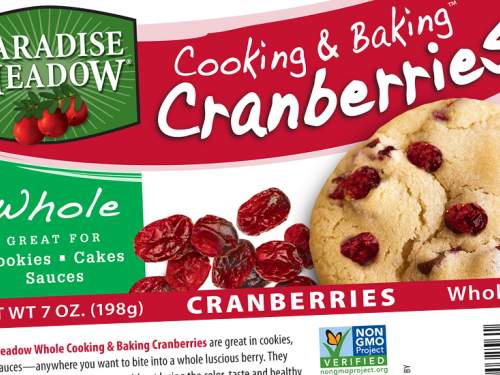
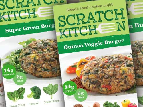
As always, appetizing photography is critical for food packaging. Guy With Glasses is expert with photo shoot direction and also shepherding the printing process for best results.
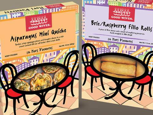
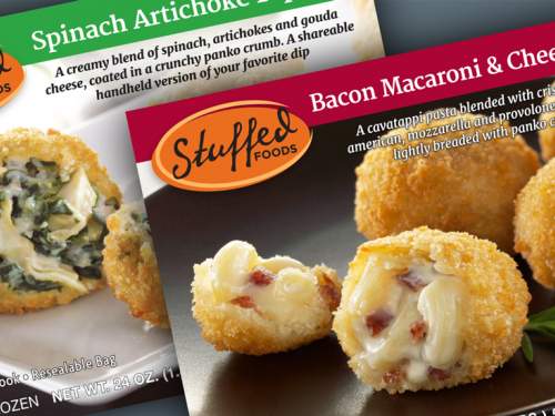
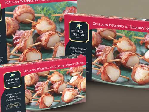
The client’s standard appetizer product packaging can be seen here.
